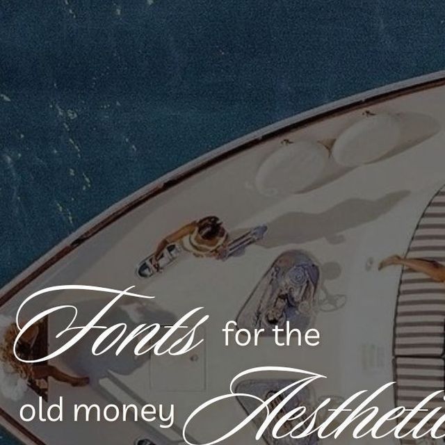
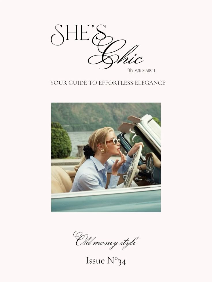
9 Aesthetic Fonts That Scream “Understated Wealth”
Disclosure: This post contains affiliate links. As an Amazon Associate, I may earn a commission if you purchase through my links, at no extra cost to you.
In an era where quiet luxury is replacing flashy logos, the fonts you choose can speak volumes—subtly. Whether you’re building a brand, designing a moodboard, or curating content that feels effortlessly elevated, fonts that suggest understated wealth are your secret weapon. These typefaces whisper elegance, timelessness, and refined taste without ever trying too hard.
In this post, we’ll explore nine fonts that embody sophistication in its most minimal form. Each font is a nod to refined aesthetics, making them perfect for branding, websites, and digital content that aspires to quiet luxury.
What Makes a Font Feel “Rich”?
Before diving in, let’s define what we mean by a font that exudes wealth—discreetly. Fonts that signal affluence usually share a few key characteristics:
- Clean, minimalist lines
- Classic serifs or elegant modernity
- Balanced proportions
- Excellent legibility
- Timeless, not trendy
These fonts feel curated. They don’t shout. They suggest quality, design awareness, and a touch of European art-school restraint.
1. Didot
With its high contrast between thick and thin strokes, Didot is the definition of modern elegance. Often seen in luxury fashion branding (hello, Vogue), it adds a sense of gravitas to any text.
Use it for: Magazine titles, high-end brand logos, fashion-forward Pinterest graphics
Style tip: Pair it with a sans-serif font like Helvetica Neue for a contemporary contrast.
2. Garamond
Garamond has been around for centuries, and for good reason. It’s sophisticated without being stiff, making it ideal for long-form copy that needs to feel elevated.
Use it for: Editorial layouts, product descriptions, minimalistic blogs
Style tip: Garamond looks incredible in muted color palettes like stone, sand, or ecru.
3. Cormorant Garamond
This open-source serif has all the elegance of classic Garamond but with a more artistic twist. It’s airy, elegant, and feels almost custom-made.
Use it for: Wedding stationery, branding for luxury service-based businesses, personal blogs with a refined voice
Style tip: Use the italic styles to add romantic, subtle flair.
4. Baskerville
With a refined, academic tone, Baskerville brings old-money energy into the digital age. It’s stately, yet soft enough to feel personal.
Use it for: About pages, personal essays, boutique branding
Style tip: This font pairs beautifully with neutral, monochrome aesthetics and linen-textured visuals.
5. Neue Haas Grotesk
A revival of the original Helvetica, this sans-serif brings understated Swiss precision into your design. It’s minimal and unobtrusive, yet striking in its balance.
Use it for: Clean web design, minimalist Pinterest pins, fashion editorials
Style tip: Keep spacing generous and layouts airy to enhance the modern luxury vibe.
6. Freight Display
Freight Display is the kind of font that feels at home on an artisan coffee label or a boutique interior design site. Its subtle quirks add personality without breaking the illusion of elegance.
Use it for: Creative portfolios, high-end service websites, elevated product packaging
Style tip: Use lowercase for a soft-spoken, approachable richness.
7. Canela
Canela feels like a fresh take on tradition—part serif, part fashion experiment. With high contrast and delicate terminals, it brings a modern softness to traditional luxury.
Use it for: Brand headlines, lookbooks, high-fashion landing pages
Style tip: Use large sizes to showcase the elegance in the letterforms.
8. Maison Neue
This minimalist sans-serif font is the epitome of “less is more.” It’s quietly confident and ultra-refined, perfect for when you want your content to feel exclusive but unpretentious.
Use it for: Portfolio sites, neutral-toned lifestyle blogs, subtle brand identities
Style tip: Pair it with thin line illustrations or subtle gold accents.
9. Recoleta
Recoleta blends vintage charm with modern geometry, resulting in a font that feels curated, editorial, and expensive.
Use it for: Pinterest graphics, moodboards, bold yet polished branding
Style tip: Use it sparingly and always in full caps for maximum impact.
Final Thoughts: The Wealth Is in the Details
When building an aesthetic that screams understated wealth, every element matters—from textures and color palettes to, yes, typography. These fonts don’t just look beautiful; they create atmosphere. They tell your audience that you value quality over quantity and sophistication over spectacle.
Whether you’re revamping your brand or refreshing your digital content, incorporating these fonts into your design toolkit is an effortless way to elevate your visual identity.